Disclaimer: I used this project to experiment with the way we publish projects. Since I'm no longer a freelance, I will try to explain the project so you can understand it and learn from it, instead of sell it to gain commercial success or professional recognition among your tribe. Somewhere between a blog and a movie making-of. To be honest, with this approach I am also trying to sell myself and raise my status, not to clients but to the design research and university community I am now part of. I hope you enjoy my manipulation exercise. You can also create your own narrative about it visiting nugarch.com
I was not hired because I was the better web designer in Barcelona, but because I amb an old friend of them and we worked together before. I feel very comfortable working with them, I usually want to have things in control and my proposals can sometimes lack surprise or risk, but they know how to turn me on.
A browser site in 2008
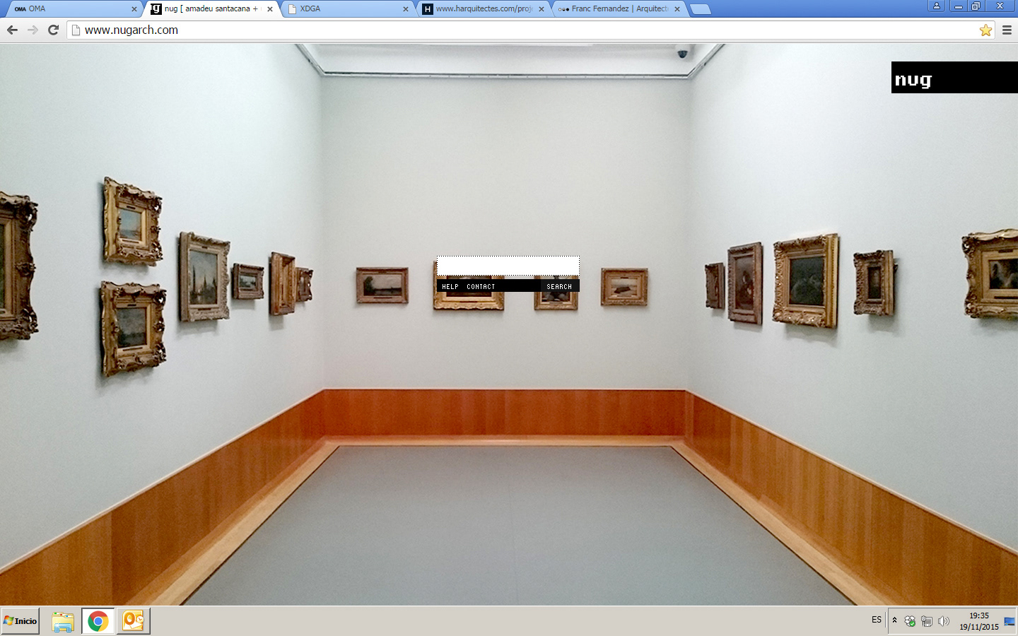
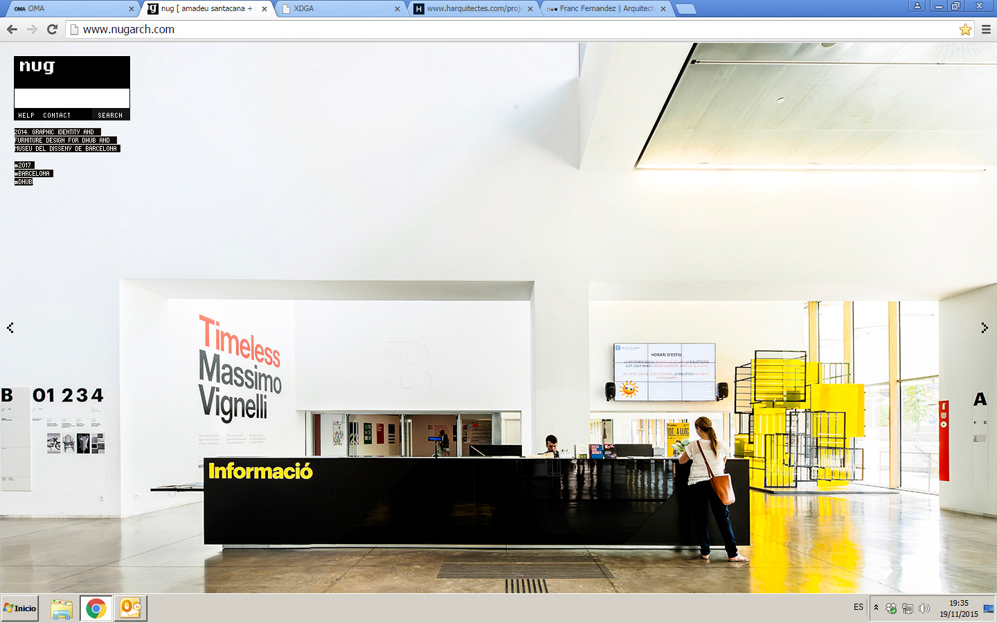
In 2008 we created the first website with the concept of a browser: no menus, no projects on the homepage, no easy navigation. Just a search field. We are not used to it and its somewhat confusing, it requires initiative to see something. They knew it was not commercial: “we don’t want the kind of client that complains about this site”. A sort of bad clients filter. So in 2017 we started the new site lying to ourselves with the classic: “it’s just an update with bigger pictures”.
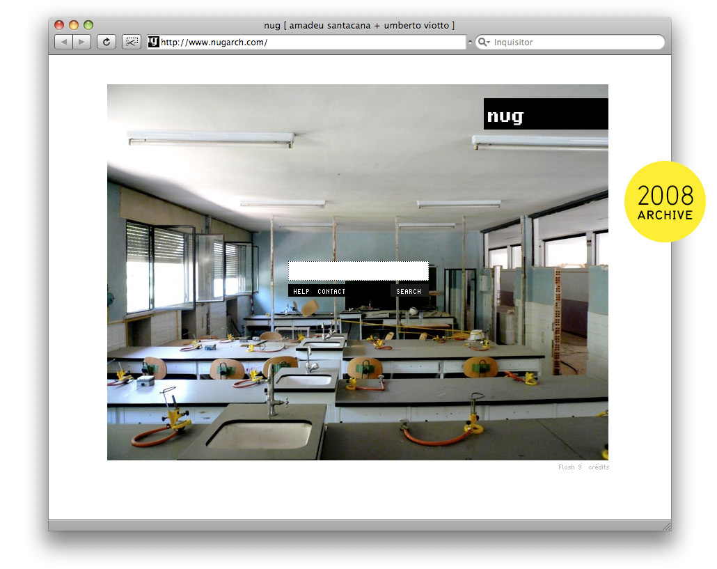
screens from the first site in 2008
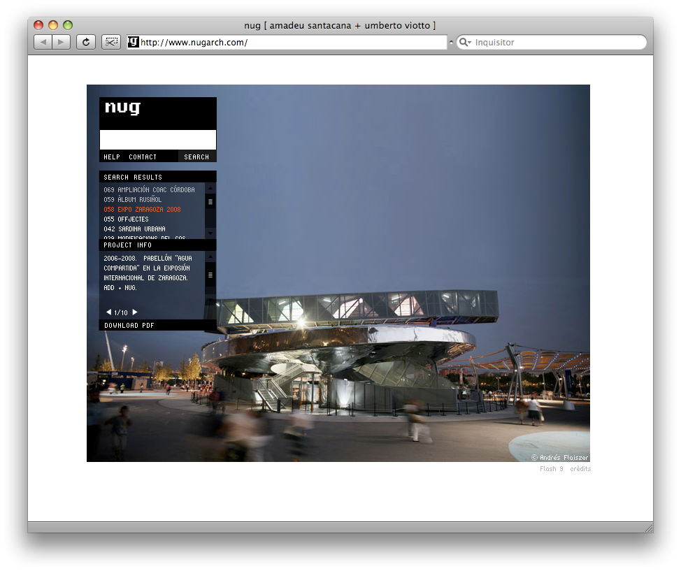
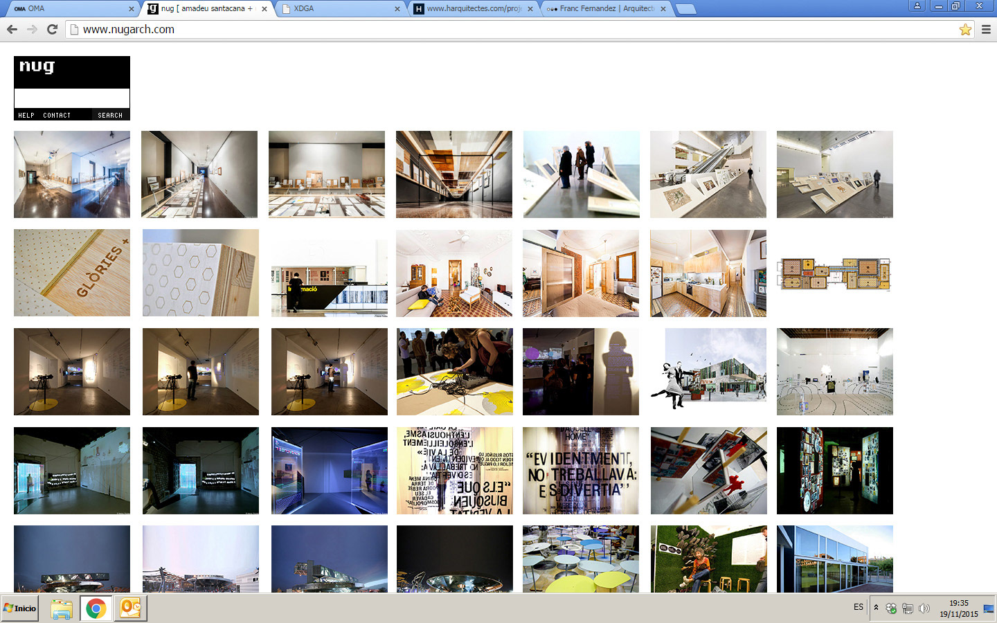
Not projects but architecture approach
The site homepage does not feature their latest project as usual. It shows scenes where architecture goes beyond the conventional professional superstar definition, mundane scenes where architecture plays a relevant role, often ugly and amateur solutions observed from a critical and ironic perspective. This probably is influenced by one of their members previous employment by Actar Publishers, where they worked closely with architecture photographers like Jordi Bernadó.
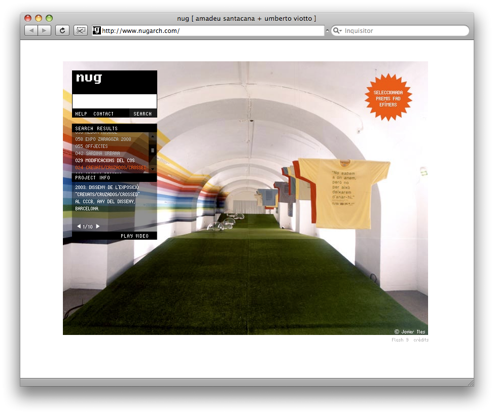
Strategies and Keywords
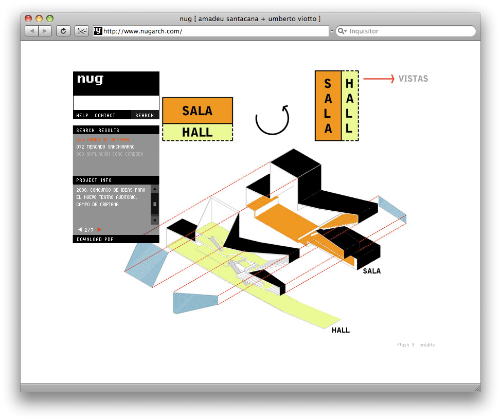
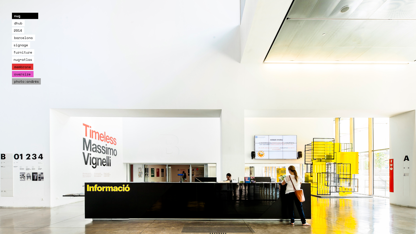
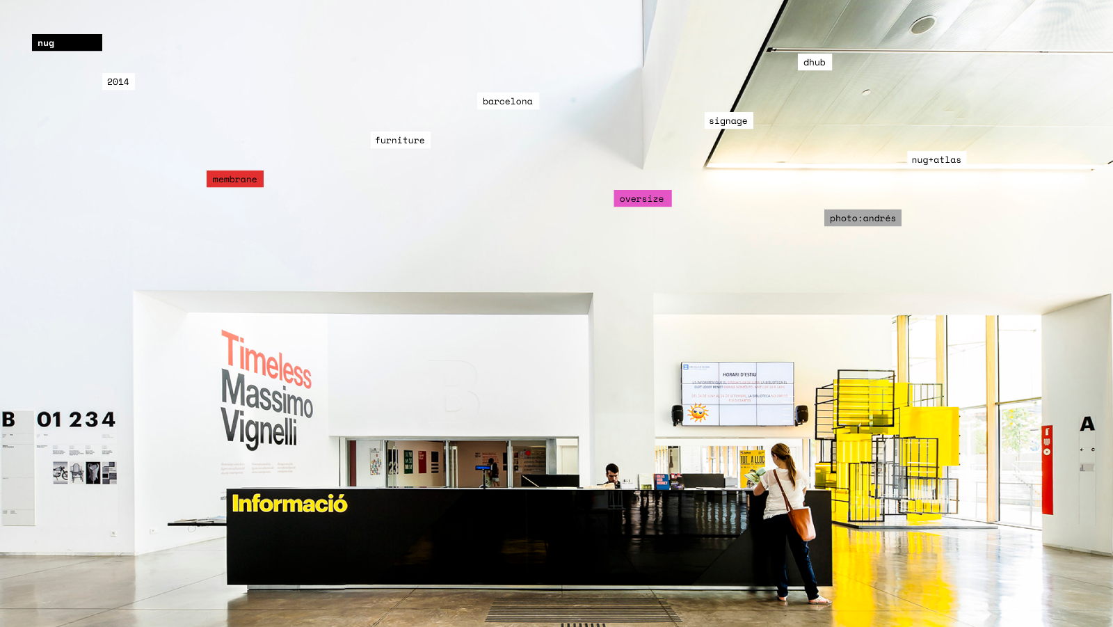
This time the browser idea became more sophisticated: the portfolio was not just an accumulation of disconnected little boxes (projects) filled with things (photos). Instead of using the project as the unit they used a collection of architecture strategies that cross their comissions. Not a tree structure but a network. It’s a brilliant idea. Projects are administrative units (contract, invoice). A studio is a repertoire of approaches, techniques, styles, materials, solutions… keywords. You can notice them in every creative, some concepts appear here and there along their career, and projects are just another stage in the concept evolution.
Complexity behind simplicity
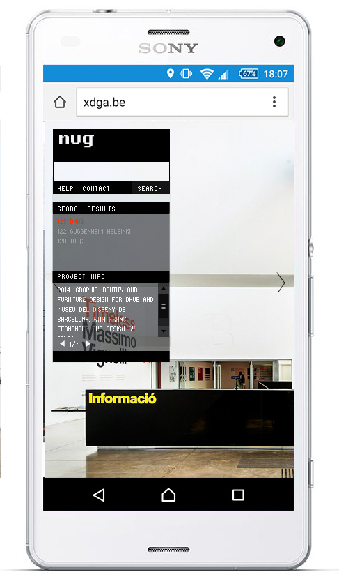
The site looks empty, it does not offer things to do, it does not show off merits, it does not offer a newsletter subscription, it does not move. The browser idea is simple to understand but it’s tricky to apply it, achieve an interesting user experience and an easy back-end site management. How are results filtered and ordered? Many small decisions that added complexity to the database and the query criteria. The search works with dates, locations or concepts among others. It allows multi-language searches, it suggests results, it works different in phones and have little hidden surprises.
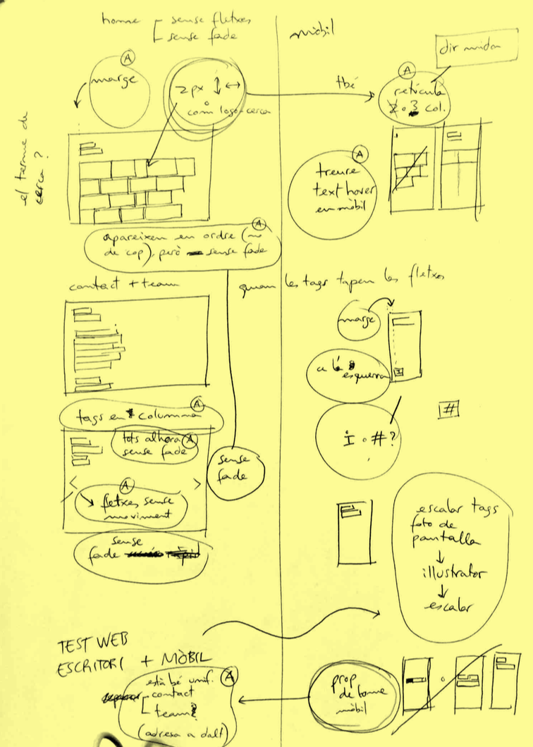
Creative process and discarded proposals
The project did not start with a brief, Nug expressed how they envisioned the site with a collection of screens based on the previous site. Having the client designing is a scary image for a designer, but in this case it made sense because the idea was to update the old site, because we were friends and they knew I didn’t have much time to work on the project and starting visual would speed up the process. We refined the site through seven iterations between April and July 2017.
initial sketches made by Nug, April 2017
Coloring the tags emphasized the concepts but depending on the image could mess up the colors. Nug quite liked the black and white attitude and preferred to keep the design as discreet and minimal as possible. In the second image I tried to challenge the convention that the container (web) should not interfere the content (images). As expected it was discarded but I think it had a point: since you can’t publish a building on the web (only images of it) accept the medium, its limitations and opportunities, and address the site as a project, not a neutral container.
Production, money and project management
The team articulated three actors: Nug Architecture, web developers and me as a designer. The design proposal required work but advanced consistently and efficiently. The collaboration with the web developers started well but the communication with Nug wasn’t frequent enough, the database fine-tuning took longer than expected and that caused some frictions in the end. Setting expectations right and defining the scope of the project is really difficult.
Nug came to me willing to hire me with the regular professional fees, but I declined any fee because I was at the end of my master thesis, working nights and weekends and I knew I would’t be able to keep a professional pace, so doing it for free was a way to avoid pressure. I did accept a weekend in a charming village as a gift :)