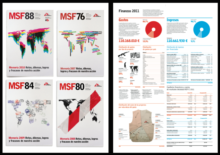
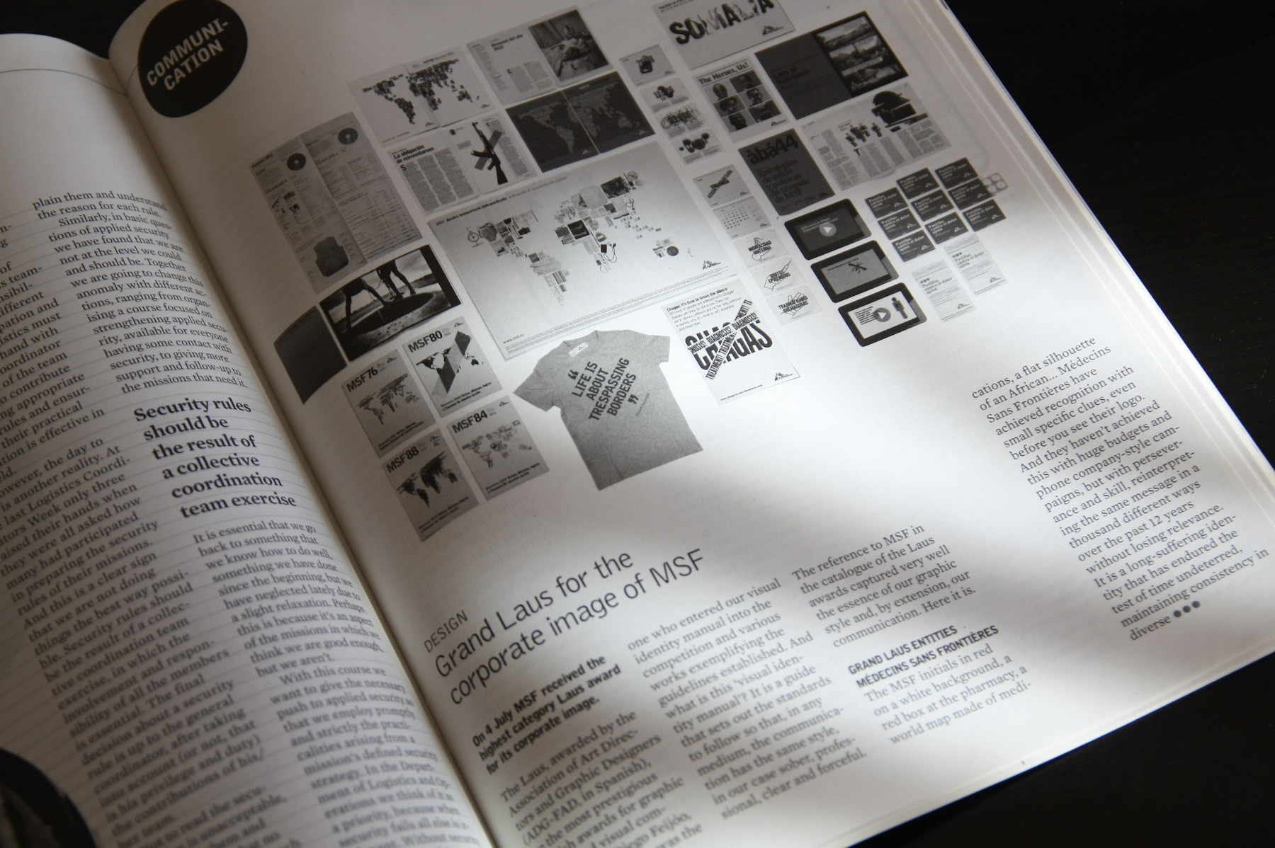
MSF initials in red on white, a red box in the pharmacy, a world map made of medicines, a flat silhouette of Africa... Just a hint is enough to identify Médicos Sin Fronteras (Doctors Without Borders), long before seeing logo. And it hasn’t achieved this by the crazy advertising budgets and media pressure used by phone carriers but with skills and perseverance, playing in countless ways the same score for 12 years without losing freshness. It’s a robust identity that has endured years without flinching and has maintained consistency in contexts as diverse such as publications, exhibitions, and interactive campaigns. Has achieved something as difficult as to combine the consistency demanded by an institution with the flexibility demanded by different formats, scenarios, tones of voice.
The secret of this strength is the simplicity of the system: one color, one typeface, a simple compositional style and recurring themes photo or illustration. No complex rules or templates with endless instructions. Just a set of four ingredients and let everyone cook them freely. Probably this simple system has facilitated the incorporation of several teams of designers without inconsistencies or outbursts, and allowed everyone to find their place in the identity. It's easy when there are several teams in the game appear discordant with different styles, the cliché says that designers are better creating standards and criteria for a new corporate identity than following other designers’ rules. We all have been there, right? The authors summarize the project this way in the presentation:
Color = White / Red = Doctor
Readability = font = Transparency
Image = Witness = Recipients
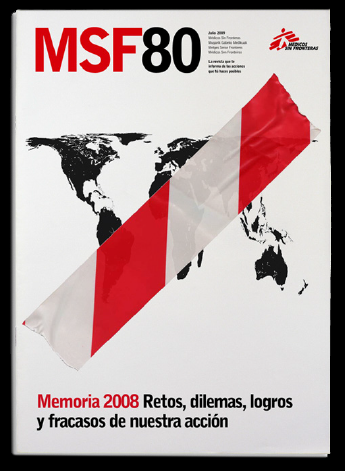
Maps = Work = No boundaries
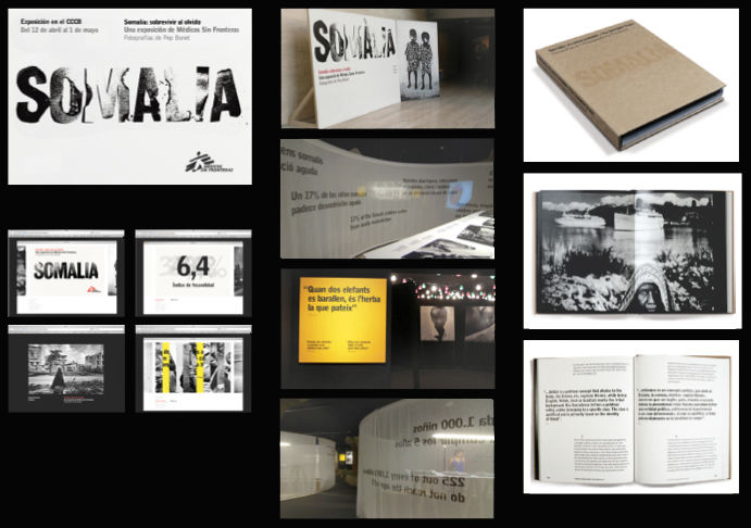
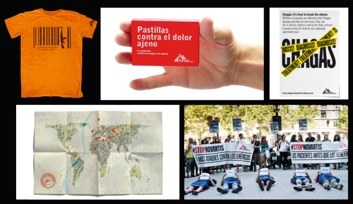
The concept of cooperation was bound to compassion and charity, wrapped with a halo of religious connotations: duty, guilt, sacrifice... It was time of images of African children surrounded by flies and slogans that made you feel bad. Fortunately, the communication of the third sector has moved away from that tear dropping narrative. Today NGOs are not asking for charity but justice, thay don’t demand compassion but involvement. If the religious style softened the graphics the humanistic approach is more harsh: "There are people suffering. Act!” MSF also has an added factor to harden the message: their fieldwork on conflict regions somehow turns them into reporters of humanitarian disasters. The graphic exhibition about Somalia at the Barcelona CCCB is a good example of this reporting style: austerity in color, troubled typography and naked composition.
The burning reality MSF deals with could make a more elaborate design to be seen as a waste of resources, a waste of time, or even worse, a way of trivializing the subject. In MSF communication there is no time for ornament, it’s the same criteria you would find in a field hospital: there are the essential tools but no TV or music. The determination to work with a restricted palette of colors becomes apparent: red on white, white on black, black on red. Red is the emergency color and ultimately the basic color, no complex or shaded colors. Accordingly, the most common background is plain white. Also the illustrations are flat silhouettes, one line without shades of gray. But if some element embodies this character is Bell Gothic typeface. It has the emergency feel, the power to condemn and character to identify MSF
The success of the designers is that this hardness demanded by the context becomes simplicity and communication efficiency with messages straight to the point, becomes clarity in pages that instruct us about an epidemic, or sobriety when it’s time to be elegant.
Opening the focus, the contribution of the project is to dignify cooperation and NGOs, clearly explain their work and project a good image of the organizations. At the same time sets an example to other nonprofit of how to integrate design into the everyday life of the organization to achieve better results. Alain de Botton wondered what would happen if the ethical values had the advertising resources of commercial products, and imagined the best creatives working on a campaign to promote ethical values. Since NGOs does not have a sexy product to sell, to give them a good identity is to give them the opportunity to compete with other brands in the race to reach citizens. Excuse me, I mean the target audience.
This article was published is the ADG-FAD Laus 2013 book and the Àbá MSF magazine